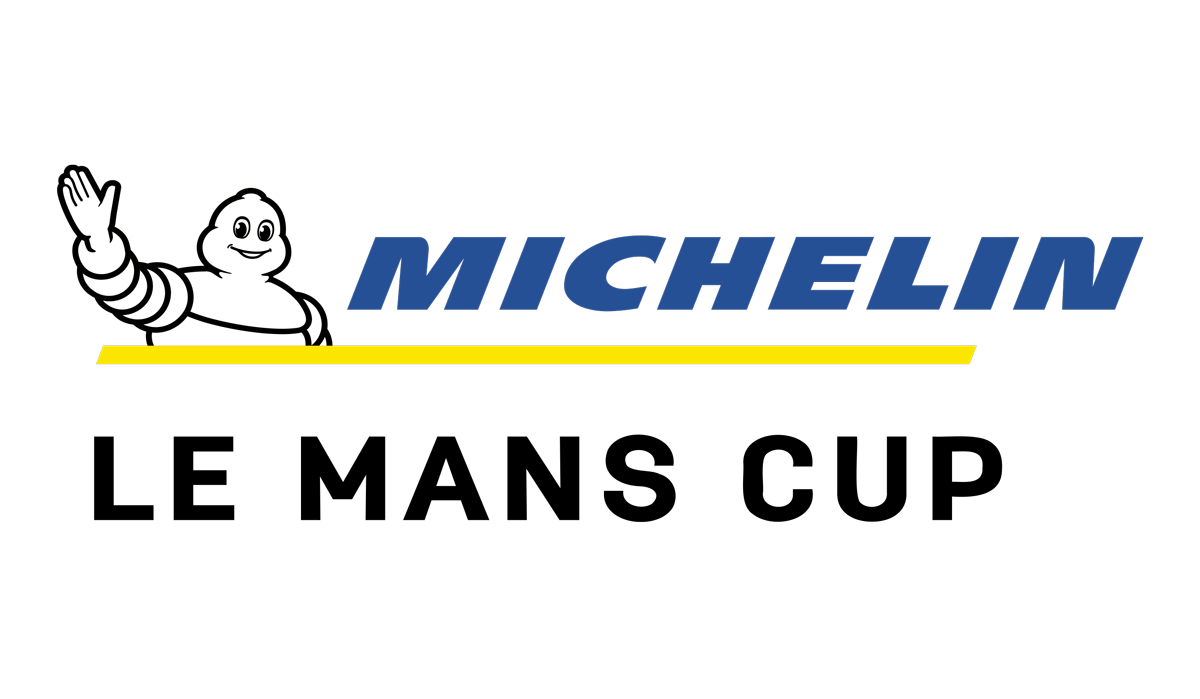
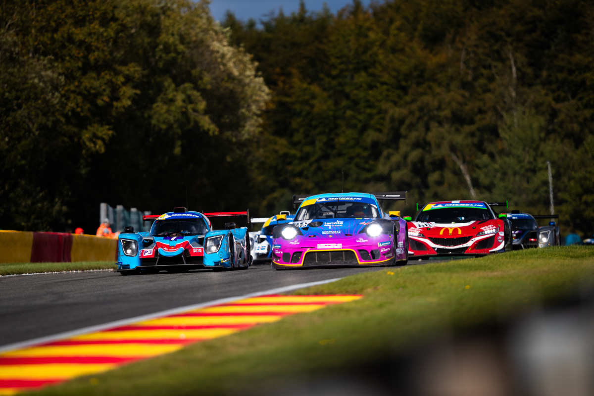
Le Mans Endurance Management introduces the redesigned logo for the Michelin Le Mans Cup, providing a renewed and modern appearance for the endurance race series in the upcoming season and beyond.
The evolution of the Michelin Le Mans Cup logo is part of a visual harmonization initiative with other championships organised by Le Mans Endurance Management: the FIA WEC, ELMS, and the Ligier European Series.
The chosen typography for "Le Mans Cup" subtly refers to the World (WEC) and European (ELMS) Endurance Championships. This artistic approach creates a remarkable visual harmony and aesthetic coherence among these competitions, all integrated within the prestigious endurance pyramid.
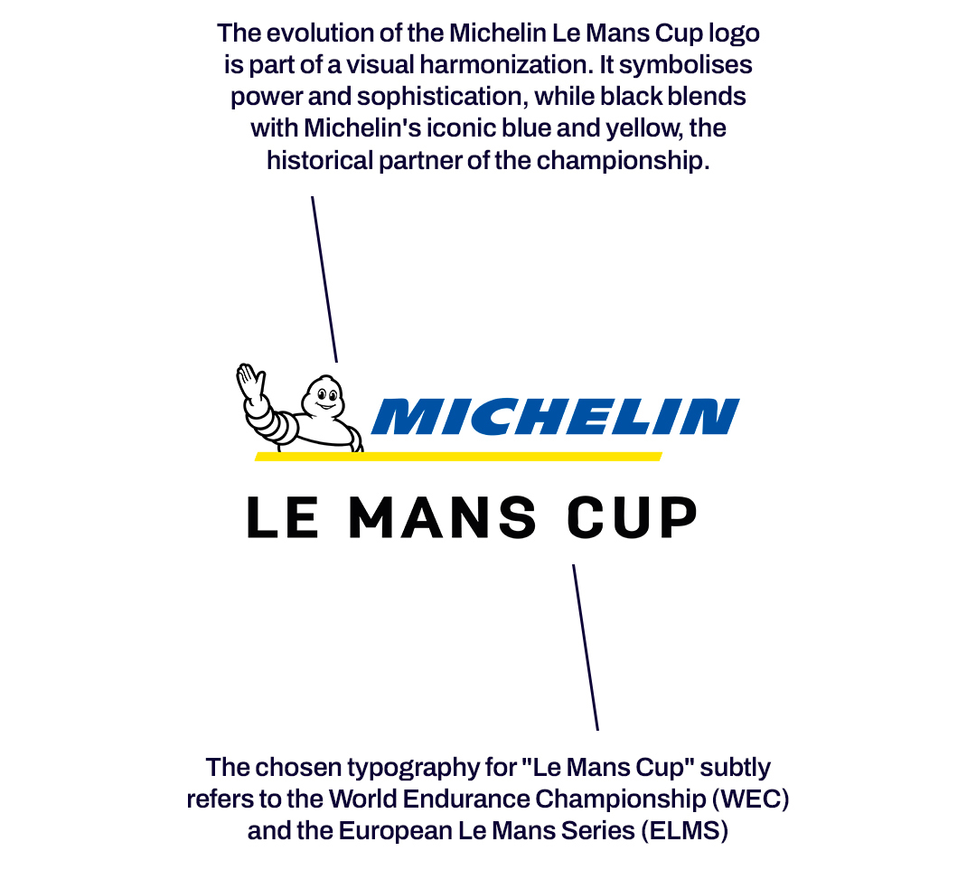
The judicious use of black in the composition of the new logo marks a profound visual transition. Symbolising power and sophistication, black blends with Michelin's iconic blue and yellow – the historical partner of the championship – resulting in a distinctive visual palette.
Ultimately, the Michelin Le Mans Cup logo embodies both modernity and dynamism, delicately drawing inspiration from the prestigious FIA World Endurance Championship (FIA WEC) and the European Le Mans Series (ELMS).
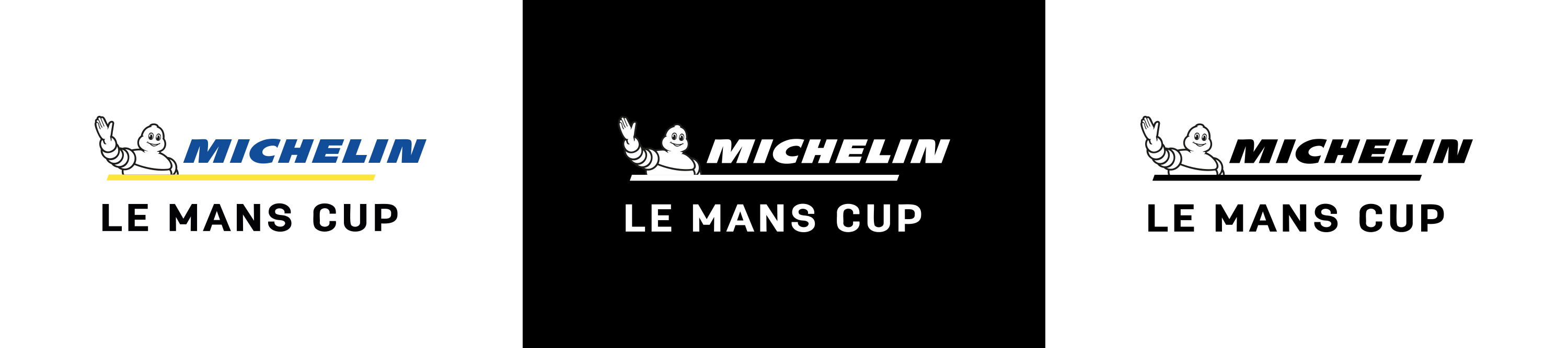
CLICK HERE to download the new Michelin Le Mans Cup logo.